
Most safety features look good on a settings page, yet fade during busy evenings. The gap is not intended. It is designed. Tools only work when they match attention spans, fit real weeks, and fire at the exact moments decisions happen. Make responsible play simple, and usage climbs. Make it fussy, and it gathers dust.
A short, practical primer near the action helps people start fast. Place a single link at the start of sessions so guidance is always accessible – for example, you may read more. When help sits beside the next decision, it gets used. When it sits in a policy footer, it doesn’t.
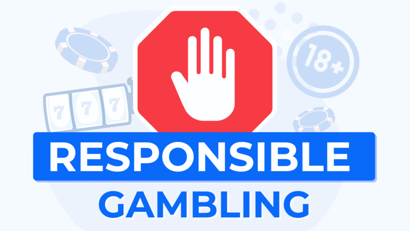
Why many “healthy play” features go unused
Friction and vagueness kill adoption. Sliders that ask for perfect numbers before a user understands their week lead to guesswork. Walls of text about “player protection” say little about what a toggle will do. The fix is to treat every control like a seatbelt – obvious, quick, and unmissable at the moment it matters. Labels should describe outcomes, not abstractions. “End the session after 30 minutes” beats “Enable timer.” And every setting needs a predictable place on screen, not a scavenger hunt through menus.
Tools also fail when they fight momentum. If a user is mid-session, they will not complete a five-step wizard. They will accept a simple pop-up with clear choices that respect the current flow. Design for that moment, and the usage curve changes.
The three-minute setup that covers 80 % of risks
- Time box: Pick a session length – 20, 30, or 45 minutes – with one tap. The app auto-pauses at time-up and offers a calm resume option after two minutes.
- Spend guardrails: Set a weekly cap and a per-stake ceiling using presets tied to typical budgets, not arbitrary maximums.
- Reality checks: Show a quiet card every 15-30 minutes – time elapsed, net movement, and a one-tap exit. No flashing, no countdown theatrics.
- Quick breaks: Add two cool-off buttons to the main view – 10 minutes and 24 hours – so pausing is easier than pushing through.
- Withdrawal lock: Once a cash-out is requested, same-day cancellations are blocked. Wins stop boomeranging back into impulse play.
- Receipts on rails: Email or push receipts for deposits, withdrawals, and limit changes land automatically in a single thread for easy review.
This kit takes minutes, not hours. It also forms a habit – the controls are set once, seen often, and adjusted rarely.
Limits that fit a real month
Caps only work when they survive busy weeks. A sensible pattern uses three layers. First, a weekly deposit cap that reflects the portion of the entertainment budget truly available after bills and savings. Second, a per-stake band that cannot bend the week with one decision, for example, two to five percent of the week’s cap. Third, a session count that caps attention, not just money. Two short windows on weeknights and one longer weekend block provide rhythm without sprawl.
Visibility matters as much as numbers. Put the current week’s remaining allowance near the thumb, not behind a profile icon. Color helps, but words do more: “$48 left this week” beats a vague ring. If the platform supports multiple payment routes, apply the same cap across them to prevent users from circumventing the rules.
Timeouts that rescue judgment
Short breaks fix more sessions than lectures do. A 10-minute pause interrupts spirals after near misses, while a 24-hour break resets when energy is low or stakes creep upward. These options must be in the main view – not tucked in a distant “responsible use” tab – and they must be fast. Two taps, a soft countdown, and a confirmation that shows the precise unlock time in local hours.
Longer breaks need dignity. Offer 7, 30, and 90-day presets with plain consequences: access blocked, messages muted, withdrawals still available. No paternal tone. Just clarity. The return should be equally straightforward – a calm page that explains when access resumes and which settings will persist.
Reality checks that inform, not nag
Good reminders act like speedometers. They report the state clearly and let the driver choose. A useful reality check shows three numbers: time in session, net movement since the last check, and progress against the weekly cap. It provides two primary actions – “Pause now” and “End session” – plus a low-emphasis “Continue” that requires a single, intentional tap. Frequency should match session style: every 20 minutes for longer windows, every 10 for short bursts. Avoid sound and vibration unless the user opts in.
Context amplifies honesty. If a limit is close, the card should say so in plain English – “You’re within $15 of this week’s cap.” If a withdrawal lock is active, the card reminds the user that today’s cash-out is queued and cannot be reversed. These small nudges prevent panic moves later.
Make the guardrails feel invisible
Responsible play works when the tools feel like part of the road, not roadblocks. Keep controls one tap from the action. Use presets tied to real budgets and times, not perfect guesses. Surface calm, factual reminders on a predictable cadence. Place pause options where thumbs naturally rest.
The result is a session that feels deliberate. Limits hold their shape. Breaks are easy to take. Records stay tidy. And the app quietly earns trust because the safest choice is also the simplest one.


Leave a Comment